| Author | Message | |||
| MarkPDX (Markpdx)
Intermediate Member Username: Markpdx Post Number: 1192 Registered: 4-2003 |
DES - Read this whole thread, the new software will allow each user to pick which order they want to view threads in.  | |||
| DES (Sickspeed)
Senior Member Username: Sickspeed Post Number: 7504 Registered: 8-2002 |
Frank, that's probably been the most frequently-requested option... i doubt it'll change from the way it is... | |||
| MarkPDX (Markpdx)
Intermediate Member Username: Markpdx Post Number: 1189 Registered: 4-2003 |
Frank - Read the whole thread | |||
| Frank (Sparta49)
Member Username: Sparta49 Post Number: 551 Registered: 3-2001 |
how about having the first post at the top of the page and all the others follow it so you don't have to scroll through all the answers first | |||
| DES (Sickspeed)
Senior Member Username: Sickspeed Post Number: 7491 Registered: 8-2002 |
LMAO...! Point well taken... | |||
| Kenny Herman (Kennyh)
Intermediate Member Username: Kennyh Post Number: 1457 Registered: 8-2001 |
Rob, you can create sub-forums that aren't visable to the public. | |||
| Thomas I (Wax)
Member Username: Wax Post Number: 729 Registered: 7-2003 |
 | |||
| JohnR. (Rivee)
Member Username: Rivee Post Number: 288 Registered: 1-2002 |
Here is the TTF font "Ferro Rosso" whoever wants it.
| |||
| Rob Lay (Rob328gts)
Board Administrator Username: Rob328gts Post Number: 6746 Registered: 12-2000 |
DES, if I can create a forum and hide it, then I will. Otherwise I'll just give you your own site. Priority is a smooth switch for the other 3499 users.  We'll take care of you soon enough. We'll take care of you soon enough.  | |||
| DES (Sickspeed)
Senior Member Username: Sickspeed Post Number: 7473 Registered: 8-2002 |
Maybe we can work something out...? What does that mean...? You're going to get rid of it, aren't you...?  Just say it... Don't beat around the bush... Just say what you feel... If you're not into this relationship 100% anymore, then i need to know... Tell me how you feel, Robbie... Just say it... Don't beat around the bush... Just say what you feel... If you're not into this relationship 100% anymore, then i need to know... Tell me how you feel, Robbie... ...um, i'm just joking... i swear... | |||
| Rob Lay (Rob328gts)
Board Administrator Username: Rob328gts Post Number: 6745 Registered: 12-2000 |
I'll have to close the current one like all the other current forums, but maybe we can work something out on the new board. | |||
| DES (Sickspeed)
Senior Member Username: Sickspeed Post Number: 7470 Registered: 8-2002 |
Rob, DESchat will remain in tact, right...? | |||
| Crusing (Crusing)
Junior Member Username: Crusing Post Number: 121 Registered: 10-2002 |
Boy! We've come a long way since ExpensiveCar.com! Looks great Rob. | |||
| Rikky Alessi (Ralessi)
Member Username: Ralessi Post Number: 455 Registered: 5-2002 |
nevermind - I am crazy | |||
| Rikky Alessi (Ralessi)
Member Username: Ralessi Post Number: 454 Registered: 5-2002 |
did you disable posting? wont let me post on the board | |||
| Dan (Bobafett)
Intermediate Member Username: Bobafett Post Number: 1754 Registered: 9-2002 |
Rob: Can you rename NorCal to 'SF Bay Area' ? --Dan | |||
| Dave (Netviper)
Junior Member Username: Netviper Post Number: 54 Registered: 11-2001 |
John R... love that logo! | |||
| Rob Lay (Rob328gts)
Board Administrator Username: Rob328gts Post Number: 6743 Registered: 12-2000 |
I was bored, to start I'm given each user the option of... Default Dark Gray/Light Gray Red/Yellow Gray/Yellow Gray/Red | |||
| Rob Lay (Rob328gts)
Board Administrator Username: Rob328gts Post Number: 6736 Registered: 12-2000 |
Wow, several of the orginal testers got back on the past day. That's fine, I'll delete all the posts and users before it officialy opens though. I doubt it will open tonight. Just got back from a track day and I have to get up early. I think for now I'm sticking with the old logo and gray/gray until we can think about it more. My first priority will just be getting users switched and working out any critical bugs that hinder registration or posting. Thanks | |||
| Rikky Alessi (Ralessi)
Member Username: Ralessi Post Number: 441 Registered: 5-2002 |
yes and also, I don't know if you saw the post or not but pleaaaaaase do quick reply (put small, barebones reply form on the bottom of each main thread so you can reply directly to it while viewing the posts - also I think it would be a good idea to disable all of the posts loading under the reply box on the actual reply screen, but I guess that is up to you, it does make it take a lot longer to load though | |||
| Mr. Doody (Doody)
Intermediate Member Username: Doody Post Number: 2017 Registered: 11-2001 |
BUGS go into usercp and click on profile. edit up whatever you please and when you click submit it complains that the birthday is invalid - though it's not one of the fields you enter. go into usercp and click on options. click on the "Change Avatar" button and instead of getting a message that avatars are disabled (like if you click on the Avatar link at the top of the usercp page; or on the "More Info" link), it just acts as if you hit the Submit button. doody. | |||
| Mr. Doody (Doody)
Intermediate Member Username: Doody Post Number: 2016 Registered: 11-2001 |
i believe FNA legal will have issues if you use the official typeface. they're probably not entirely happy that the word "ferrari" is in the site name, so i wouldn't push your luck . doody. | |||
| Rikky Alessi (Ralessi)
Member Username: Ralessi Post Number: 440 Registered: 5-2002 |
I really like the red and the yellow (the way that it is set up now) | |||
| Waldo Aikema (Forzarossa)
Junior Member Username: Forzarossa Post Number: 53 Registered: 7-2003 |
I like Johns logo for the FC! Very nice, (and I look with a 'professional' eye (I'm a graphical designer ) But I wander if you might get trouble when you use it with Ferrari, because it looks a lot like the Ferrari logo... | |||
| David N (Nboy)
New member Username: Nboy Post Number: 41 Registered: 7-2003 |
Rob, Great work with the site! JohnR's logo looks pretty cool, and would make this site look a little different than all your other sites. For my $.02, I think the red AND yellow title bars remind me of a hotdog stand (ketchup and mustard). Either red OR yellow with shades of gray looks great. David | |||
| JohnR. (Rivee)
Member Username: Rivee Post Number: 287 Registered: 1-2002 |
Rob, how bout a new title like:  | |||
| MarkPDX (Markpdx)
Intermediate Member Username: Markpdx Post Number: 1146 Registered: 4-2003 |
I didn't have any problems registering and posting. 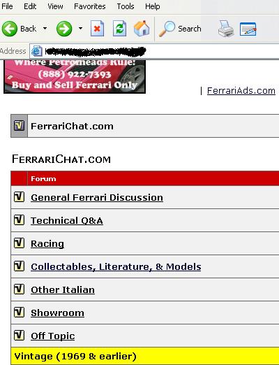 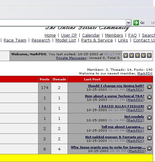 Hope I didn't cause any problems  | |||
| '75 308 GT4 (Peter)
Advanced Member Username: Peter Post Number: 3182 Registered: 12-2000 |
Rob, you also missed "Canada" in your regional area section... Other than that, looks great. | |||
| Vince (Manatee)
Member Username: Manatee Post Number: 447 Registered: 6-2002 |
Quote from Rob Lay How did you know the link? Were you one of the orginal testers? Won't be any subscriptions for the current users for 6 months. What do you mean it wasn't right? When I do activate subscriptions, you will have to register, but you won't have permissions until subscribing. Rob, yes, I was one of the original testers. When I clicked on the 'subscription' link provided in the email, it gave me an error message that I was not allowed to access this page. The script at the top of the error message page looked like the 'old' ferrarichat. I'm sorry if I messed things up by going over to the new forum. | |||
| Rob Lay (Rob328gts)
Board Administrator Username: Rob328gts Post Number: 6735 Registered: 12-2000 |
Vince, yes, still haven't made 100% ready yet. How did you know the link? Were you one of the orginal testers? Won't be any subscriptions for the current users for 6 months. What do you mean it wasn't right? When I do activate subscriptions, you will have to register, but you won't have permissions until subscribing. | |||
| Brian Kennedy (Kennedy)
Member Username: Kennedy Post Number: 591 Registered: 3-2002 |
I really like the forum list with the red/yellow... nice balance of colors. Might work a little brighter, but I think its bright enough. I think the thread list will also look good once there are a reasonable number of threads in the list. With just three threads, it seems a bit red-heavy... but 3 threads is NOT a normal state. And here the red could also go a bit brighter, but is fine as is. The one that worries me is the individual thread... that's too much red and yellow... but it would also be a lot of grays. The current thread format just alternates the background gray of each message, with no separator. I like that minimalism. The date of the post isn't really so important that it ought be highlighted in its own header, whether red, yellow or gray. But given that is there, gray would be the least offensive. So, given how you worded your query, I assume all three are tied together... as much as I like the red+yellow on the forum list and thread list, I think many will find it intolerable on the message list (individual thread)... thus, if I can't vote to have it like the current individual thread format, and I can't vote to separate the last from the first two, then I would probably suggest you stick with grays. Hope that helps. | |||
| Vince (Manatee)
Member Username: Manatee Post Number: 442 Registered: 6-2002 |
Rob, I registered on the new site without incident. However, the 'subscription' component is not quite right and I can't post on the forums even after logging in. Maybe I wasn't supposed to jump the gun - sorry | |||
| Rob Lay (Rob328gts)
Board Administrator Username: Rob328gts Post Number: 6733 Registered: 12-2000 |
The new software will let you choose the post order. Default will be oldest on top. I guess my 3 year campaign to change the world didn't succeed. Life is lonely as a Libertarian, Unitarian Universalist, new posts first guy. Ok, here's your red code Brian, maybe even more red Brian? This still looks a little Rossa Barchetta. However, fine line between Ferrari looking and too bright. Maybe in the future I'll make several color combos available for each user to select on their own, like the sort order. Please consider all 3 of these levels and how the color combo looks. So red/yellow or dark gray/gray? Main page... 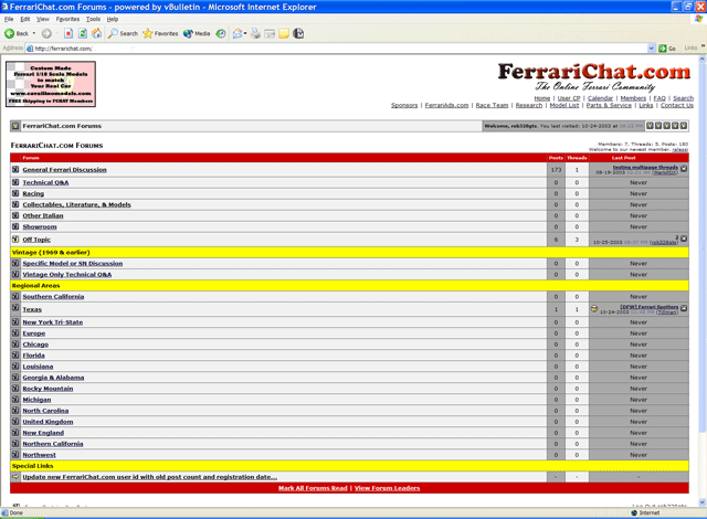 Thread list... 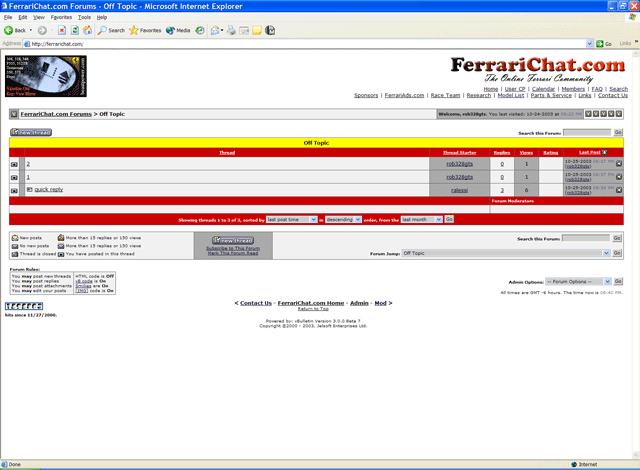 Individual thread... 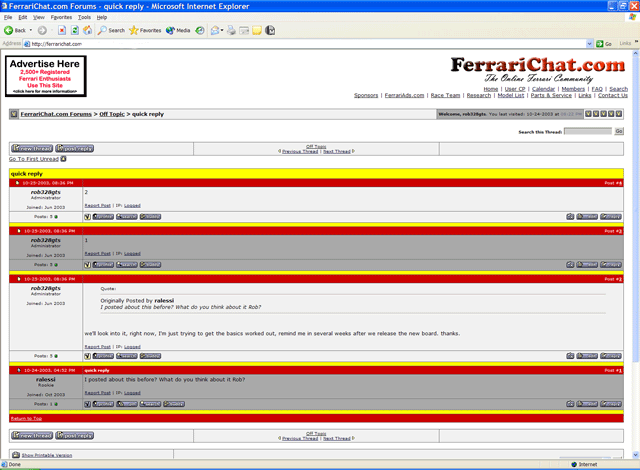 | |||
| Brian Kennedy (Kennedy)
Member Username: Kennedy Post Number: 574 Registered: 3-2002 |
> And, I'd also like the last post to be at the top, as others have already said. On that topic, if the new software lets us each choose, that'll be great. Personally, I'd rather them listed most recent post at bottom... as that's how the other forums I use work and I find it easier to read several posts that way. BTW, despite that, Fchat is my favorite forum functionally (as well as content), primarily because it does a good job of keeping track of what I've read... that is, the threads I've read and nothing new has been posted are always in the highlight color. Even days later after multiple updates... it remembers. That makes it sooooo much easier to skip around and do a bit of reading or go back and catch up. That coupled with consistent display of most recent times in the forum list and thread lists makes it soo easy to use. Thanks Rob!! | |||
| Frederick Thomas (Fred)
Member Username: Fred Post Number: 857 Registered: 2-2001 |
I like it with some color. | |||
| Ed Christophersen (Dr_c)
Junior Member Username: Dr_c Post Number: 95 Registered: 12-2002 |
Rob: I prefer the yellow lines to the red. And, I'd also like the last post to be at the top, as others have already said. Sure do appreciate the effort you put into the site. | |||
| Brian Kennedy (Kennedy)
Member Username: Kennedy Post Number: 573 Registered: 3-2002 |
Personally, I like the red and yellow... but I might use CC0000 instead of 990000... I think its still dark enough to not be annoying, but looks more "Ferrari".  The yellow for the secondaries instead of the gray makes it a lot easier to spot the sections. | |||
| rob guess (Beast)
Member Username: Beast Post Number: 451 Registered: 5-2003 |
Rob; Any way to get the internet filters like "Websence" to not detect the site as "internet chat"???? This way i can F-chat at work... Other than that it looks great. Rob Guess "The Other Rob" | |||
| Rob Lay (Rob328gts)
Board Administrator Username: Rob328gts Post Number: 6727 Registered: 12-2000 |
A couple more with yellow... 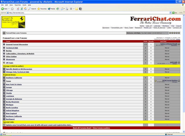 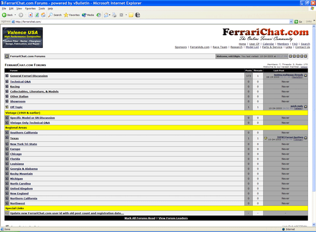 | |||
| Erik (Teenferrarifan)
Member Username: Teenferrarifan Post Number: 409 Registered: 2-2003 |
Yo Rob I liked the Yellow. Red isn't bad though Erik | |||
| Rob Lay (Rob328gts)
Board Administrator Username: Rob328gts Post Number: 6726 Registered: 12-2000 |
Brian and all, OK, here's what I did. The dark red on the main page is for the Header and Footer. On the second page which is within the forum that's how the same Header and Forum are placed. I can choose bascially any color, but we have to consider how they appear on both the main page and within each forum. In these pics the settings are... Category Strips: #A9A9A9 - Light Gray Table Header: #990000 - Dark Red Table Footer: #990000 - Dark Red So let me know any advice or suggest a combo for me to try, it's easy to do and take a screen print. I have Ferrari events all weekend, so I might not get to it right away. 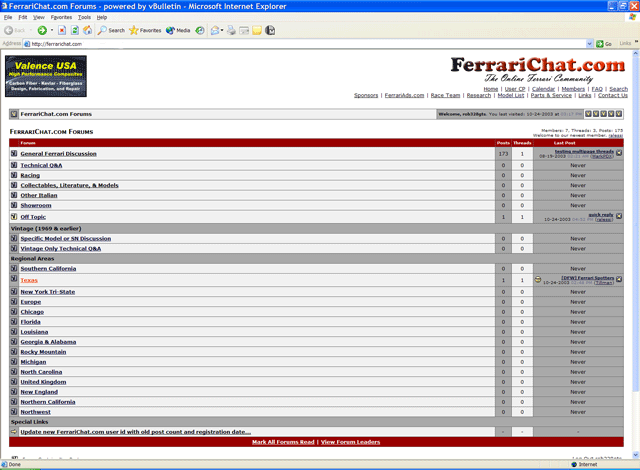 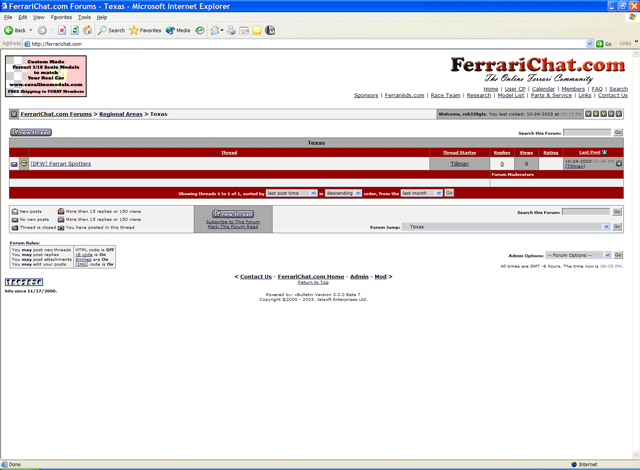 | |||
| Brian Kennedy (Kennedy)
Member Username: Kennedy Post Number: 571 Registered: 3-2002 |
Rob, I wouldn't make the lines red... keep the main areas grays... I'd only put color in the headers that you don't really read (after the first few visits). I think if you pick a darker red, like the "C" in the Ferrarichat header, it won't be too bright or annoying, but will give it a bit of distinctiveness. JMHO... definitely not critical. | |||
| Jordan Witherspoon (Jordan747_400)
Intermediate Member Username: Jordan747_400 Post Number: 2335 Registered: 12-2002 |
I see southern California is still on top Looks great though Rob! It may have been mentioned before, but can we keep our same profiles, post #s, and so on? | |||
| Andy Falsetta (Tuttebenne)
Member Username: Tuttebenne Post Number: 325 Registered: 3-2003 |
Oh yes, one more point. Is there a way to economically have spell check on a site like this? I am not an IT guy and have learned to lean on this kind of technology. | |||
| Andy Falsetta (Tuttebenne)
Member Username: Tuttebenne Post Number: 324 Registered: 3-2003 |
Looks fine. I hope it makes your life a little easier. No doubt we'd all be living in our own vacuum if it wasn't for your effort to set up F-Chat. If the $ 9.95 membership fee is going to happen I support it. Where else can we get this kind of info and camraderie for 10 bucks ? Best wishes at the track | |||
| Mike Tinker (Mikeyt)
New member Username: Mikeyt Post Number: 32 Registered: 1-2003 |
Rob- Good job. You da man. | |||
| -- (Netviper)
New member Username: Netviper Post Number: 44 Registered: 11-2001 |
it looks the same. Why dont you let me make a sweet header for the site so it looks a little more professional. | |||
| Joop van der Meer (Jhjvdm)
Junior Member Username: Jhjvdm Post Number: 128 Registered: 5-2003 |
Okay, MarkPDX - that takes away the base of my post and I dont't mind! Now it's up to everybody to stay to the point in order to create 'clean' threads. Thanks. | |||
| Drewh (Drewh)
New member Username: Drewh Post Number: 5 Registered: 10-2003 |
I would also like to know why you can't view the first post at the top of the screen instead of having to scroll down to the bottom and read up? DrewH | |||
| MarkPDX (Markpdx)
Intermediate Member Username: Markpdx Post Number: 1128 Registered: 4-2003 |
IIRC the new software allows you to choose which order to view threads in. | |||
| Joop van der Meer (Jhjvdm)
Junior Member Username: Jhjvdm Post Number: 127 Registered: 5-2003 |
Rob, Have you considered placing the first post of a thread at the top and putting all subsequent posts below it? Sometimes I have to scroll all the way down to see the contents of the post of the originator. The advantage of this top-down approach is the logical sequence of a thread and it shows what the first message was all about in the first place. That way posters might remain more to the point, because some threads tend to develop to totally different stories. This would in my opinion be more user-friendly Regards and succes with the further development | |||
| BobD (Bobd)
Intermediate Member Username: Bobd Post Number: 1600 Registered: 3-2001 |
Rob, I don't know, this new stuff looks pretty complicated. Will the migration to the new platform require Webex training? | |||
| Kenny Herman (Kennyh)
Intermediate Member Username: Kennyh Post Number: 1445 Registered: 8-2001 |
Rob, it's just an alternative theme- I could help you if you'd like (email me). | |||
| Rob Lay (Rob328gts)
Board Administrator Username: Rob328gts Post Number: 6724 Registered: 12-2000 |
LOL, that's between Des and me. This software is amazing, there is so much you can do, don't know if that was a 2.0 hack or standard. It's doable either way though. | |||
| MarkPDX (Markpdx)
Intermediate Member Username: Markpdx Post Number: 1126 Registered: 4-2003 |
The banner ads are fine, I was thinking something a little stealthier like this: 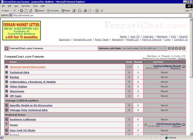 I think you can set up different style sets that users can choose from. The big bold Ferrarichat.com banner at top could be the default setting but people could choose a less obvious style if they wanted. Here it is on Corner-Carvers, they are running vBulletin 2.3.0  My final concern is what will become of DESchat? | |||
| Rob Lay (Rob328gts)
Board Administrator Username: Rob328gts Post Number: 6721 Registered: 12-2000 |
| |||
| Robert Callahan (Rcallahan)
Member Username: Rcallahan Post Number: 379 Registered: 7-2002 |
Just kidding! | |||
| Robert Callahan (Rcallahan)
Member Username: Rcallahan Post Number: 378 Registered: 7-2002 |
Rob, You spelled Ferrari wrong. | |||
| Rob Lay (Rob328gts)
Board Administrator Username: Rob328gts Post Number: 6719 Registered: 12-2000 |
Mark, I've found just a little scroll down might be as easy as clicking to turn it off. Although if there was a way to keep it off that might be good. Banner ads ain't going anywhere. Got to feed my horses. If I can get one last bug worked out and I think I'm close, I'll probably release Sunday night. Everyone will get an email, if your account email isn't accurate, then when you come to the old FC it will be closed and have a link to the new. | |||
| Rob Lay (Rob328gts)
Board Administrator Username: Rob328gts Post Number: 6718 Registered: 12-2000 |
yea, it's grigio titanium. Brian, I tried red and yellow in replace of the dark gray or middle gray. It wasn't bad, but really brite and last time I did that everyone complained. How about this... 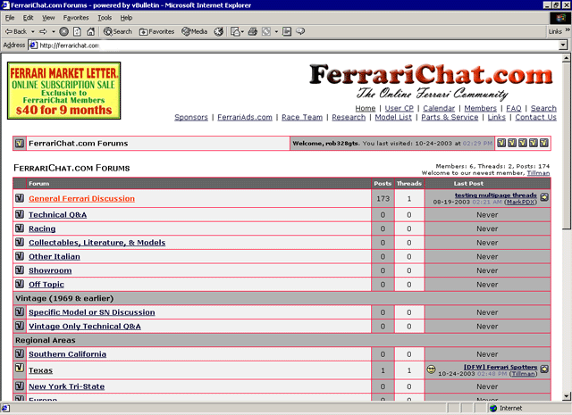 | |||
| MarkPDX (Markpdx)
Intermediate Member Username: Markpdx Post Number: 1125 Registered: 4-2003 |
How about making an option to leave the big "FerrariChat.com" banner off the top. That would make things even more work friendly. | |||
| Pat Pasqualini (Enzo)
Intermediate Member Username: Enzo Post Number: 1210 Registered: 2-2002 |
Looks good. So when will we need to re-register?? | |||
| GThomas (Ferrariartist)
Junior Member Username: Ferrariartist Post Number: 239 Registered: 2-2003 |
i like it... and the grey is good... or is it grigio titanium? (: GT | |||
| Willis Huang (Willis360)
Intermediate Member Username: Willis360 Post Number: 1696 Registered: 8-2001 |
Thank you, Rob. | |||
| Brian Kennedy (Kennedy)
Member Username: Kennedy Post Number: 569 Registered: 3-2002 |
No big deal... but I'd vote for keeping the yellow divider lines... makes it feel like Ferrari... and different from the other forums I am on. Or alternatively, given you've already switched to white text for those, going with Rosso Corsa divider lines might even be more Ferrari-like. I agree for the parts you actually read, stick with light grays. | |||
| Rob Lay (Rob328gts)
Board Administrator Username: Rob328gts Post Number: 6717 Registered: 12-2000 |
Willis, thanks for the heads up, I added Northwest. | |||
| Tillman Strahan (Tillman)
Intermediate Member Username: Tillman Post Number: 1019 Registered: 11-2001 |
I like it. No radical change, just updating the software. Simple registration process, and I like the update link. | |||
| Willis Huang (Willis360)
Intermediate Member Username: Willis360 Post Number: 1695 Registered: 8-2001 |
Where is the Northwest region or rather the "other region" section? Where did we go? | |||
| Andreas Forrer (Tifosi12)
Advanced Member Username: Tifosi12 Post Number: 2626 Registered: 10-2002 |
Very nice and have a safe race day! | |||
| KCCK (Kenneth)
Member Username: Kenneth Post Number: 679 Registered: 10-2002 |
I am first to respond! | |||
| Rob Lay (Rob328gts)
Board Administrator Username: Rob328gts Post Number: 6716 Registered: 12-2000 |
Just a couple more bugs to get worked out, hopefully release the new site early next week. I would maybe this weekend, but have Bob Smith tour tomorrow and driving the Challenge at TMS Sunday. I just want to get the new board out, it will probably change a little from this over the coming months. I'm sticking with a white background and shades of gray as I think it's easiest on the eyes and work friendly. Please offer comments... 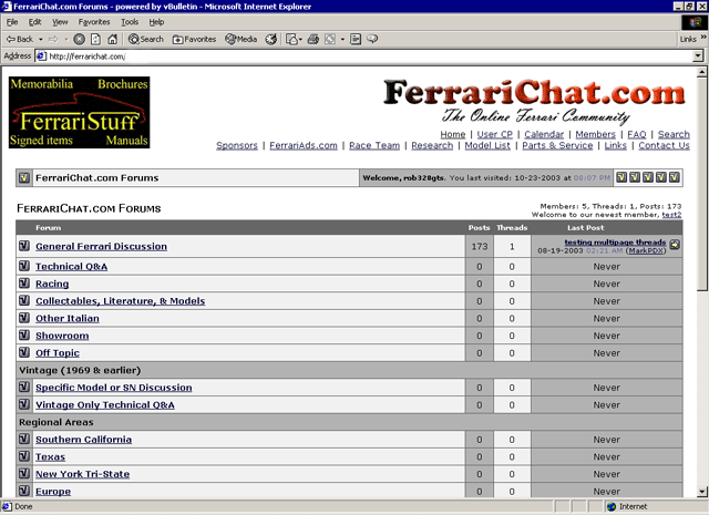 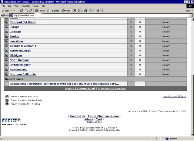 |