| Author | Message | |||
| Jeff Chiarella (Jeffc)
New member Username: Jeffc Post Number: 6 Registered: 4-2003 |
The file GTHOMAS has should work well if you plan on using a plotter to cut the letters out of self Stick sign vinyl. It will also work if you want to create a printed decal like a Gerber Edge print. This type of file is vector based which is a number of points linked together by a path, this type of file lends itself to this type of sign application much better than a pixel based file type. This type of file(Vector Based) can be scaled up or down without any quality loss. | |||
| Andreas Forrer (Tifosi12)
Intermediate Member Username: Tifosi12 Post Number: 1129 Registered: 10-2002 |
Ok Wayne, you got me on the 't' too many, true. But my translation is closer. BTW: soit is very interesting as it is the French Subjonctif, a case the English language doesn't really have. Old English as used in the Bible (as in 'thou shalt not...') is about the closest, but not exactly the same. Ok, Don, OT alarm going off. PS: Funny how a thread about Gerard Perregaux ended up in a French grammar lesson. Kinda fitting, don't you think? | |||
| L. Wayne Ausbrooks (Lwausbrooks)
Intermediate Member Username: Lwausbrooks Post Number: 1756 Registered: 8-2002 |
It appears on the Royal Coat of Arms as: "HONI SOIT QUI MAL Y PENSE" and is most often translated as "Evil to him who evil thinks," or something like that. | |||
| Jack (Gilles27)
Member Username: Gilles27 Post Number: 932 Registered: 3-2002 |
Oops. I assumed the word "pense" would have meant something else. | |||
| Andreas Forrer (Tifosi12)
Intermediate Member Username: Tifosi12 Post Number: 1126 Registered: 10-2002 |
Well, it's supposed to be French, but it is missing the accents from my US keyboard. Don't stone me for posting in French these days... It means: Shame on the one who thinks of it in a bad way. It's a French idiom. | |||
| DES (Sickspeed)
Advanced Member Username: Sickspeed Post Number: 4376 Registered: 8-2002 |
Not only haven't i clue what that says, i've not even an idea of which language it is... | |||
| Andreas Forrer (Tifosi12)
Intermediate Member Username: Tifosi12 Post Number: 1124 Registered: 10-2002 |
Honit soit qui mal y pense. | |||
| Tim N (Timn88)
Advanced Member Username: Timn88 Post Number: 3113 Registered: 6-2001 |
| |||
| DES (Sickspeed)
Advanced Member Username: Sickspeed Post Number: 4373 Registered: 8-2002 |
Andreas, you don't need to tell us everything in your personal life. Really. C'mon, now.  | |||
| Andreas Forrer (Tifosi12)
Intermediate Member Username: Tifosi12 Post Number: 1121 Registered: 10-2002 |
Thanks guys for all the good help. I'll play with it over the weekend. I'll post the results eventually, a modified 360 model hopefully soon looking like a 360GT. | |||
| GThomas (Ferrariartist)
Junior Member Username: Ferrariartist Post Number: 135 Registered: 2-2003 |
here is an eps file - not a font but vector based aw in illustrator...
dont know if this is gonna work... let me know youre email address and i'll send it to you direct if you think its suitable... by the way WATCHES are not part of the logo... it looks like Korrina but cant be sure because of the photo... | |||
| Mitch Alsup (Mitch_alsup)
Member Username: Mitch_alsup Post Number: 706 Registered: 4-2002 |
It is also close to Bankock (from the Corel Draw 3 CD-ROM). | |||
| DES (Sickspeed)
Advanced Member Username: Sickspeed Post Number: 4368 Registered: 8-2002 |
Andreas, the closest i could come is Bookman Old Style bold, but that's definitely not it... The letters on the car have curves and are only slightly seriffed whereas the letters in Bookman Old Style have a more defined serif to them and the letters aren't as curved... i'm limited, however, in my font selection... Maybe someone else has more fonts and can figure it out... | |||
| Andreas Forrer (Tifosi12)
Intermediate Member Username: Tifosi12 Post Number: 1117 Registered: 10-2002 |
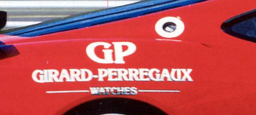 Does anybody know what the font is called Girard Perregaux uses for its logo (here on a 360GT)? I'm trying to mimick the font on the PC to create some GP decals. |